Illustration Friday BUZZ
Friday, January 05, 2007

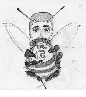
Bob's refusal to use sweetener in his coffee always caught the family off guard.
 The first sketch. The one below was supposed to be an improvement. Isn't it funny how sometimes it's almost impossible to improve on an original.
 Just not quite as nice.
13 Comments:
coffee buzz is a great feeling.
not sure what it does, but
it is useless in the decaffeinated varieties.
Cool drawings and concept.
not sure what it does, but
it is useless in the decaffeinated varieties.
Cool drawings and concept.
mister how did you make your profile pic with photoshop > liquify?
Cool distortions in there.
Cool distortions in there.
Your illustration and your caption made me laugh out loud! And I'm sitting in the lobby of a hotel, so now people are looking at me weird. Thanks for that.
I love this illustration. Great shapes, great composition and a fun, quirkly feel to it. Well done!
I love this illustration. Great shapes, great composition and a fun, quirkly feel to it. Well done!
gosh that is really funny. i like it!
Great heavy lines...super illustration and funny caption about 'tact'...
I love the faces on your sketches.
Nice weighted lines.
I like the bee wearing a bow tie. i also like how you broke up the background! great work!
hey misterhow. creative idea, love the usage of heavy black and the style.
i thought the idea was great. you could save yourself sometime when you do the sketches and not shade them in, instead use more shapes in your drawings and then you can apply color to them when you scan them in to create shadows. sorry to be critical wertz made me do it. i think you're buzz is just fine.
very nice, some lines are lost however in the body, such as the legs of the bee, making it a bit confuzing, the choppyness works for the peice but maybe it is a bit overdone so maybe you could highlight the legs more, so they stand out from the body.
i think that maybe you should make the background tie inwith the image like an outside setting and maybe a little more detail like on the wings of the image,
This is a Doc Holiday Bee for sure. Where's the whiskey wax?


commented by Anonymous,9:28 PM